2010-present
Fluid Touch
Maker
Product Design
User Experience
Visual Design
Website & Webflow
Identity
The Challenge
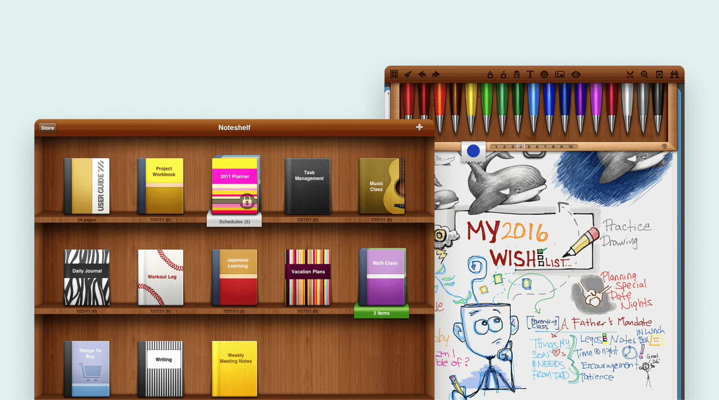
We've inherited so much legacy as one of the first few applications available for the iPad's initial release in 2010. Features were prioritized over focus, scalability and clarity.
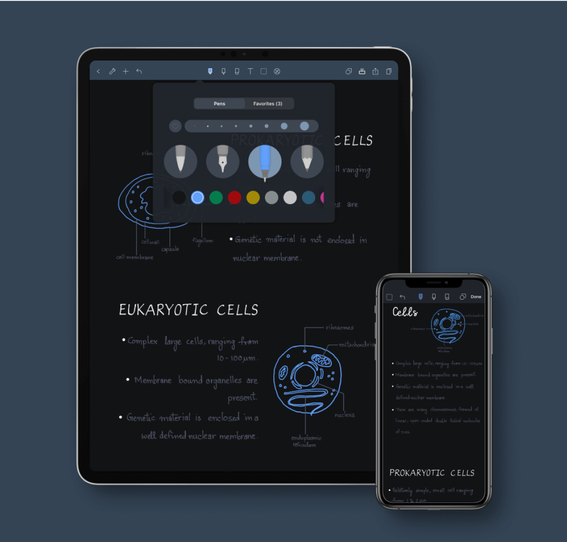
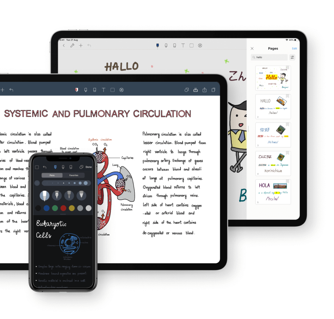
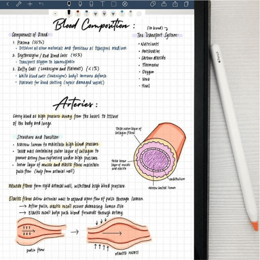
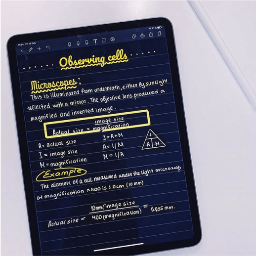
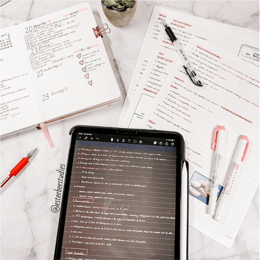
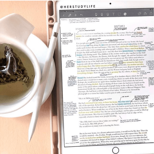
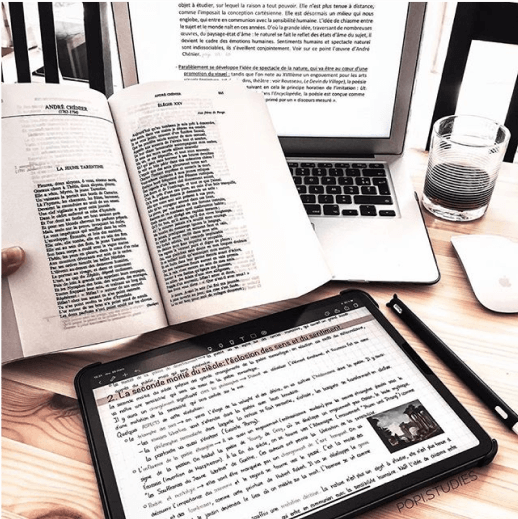
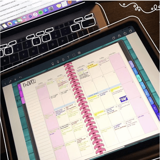
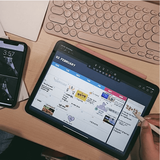
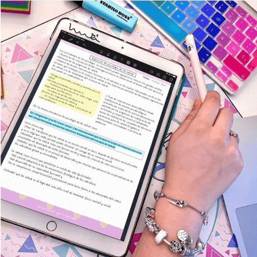
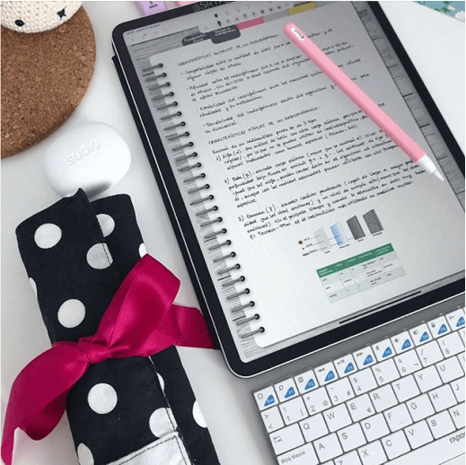
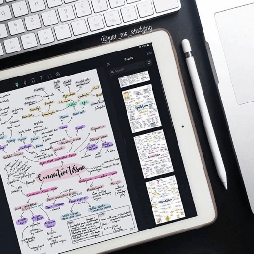
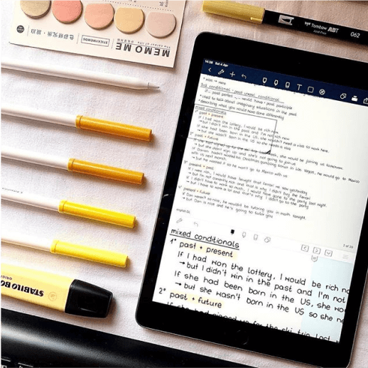
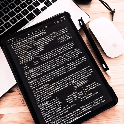
The userbase has evolved from business people into creative young professionals, students, diarists and planners -- all who wanted the authentic feeling of ink to paper in digital handwriting.
Discovery
Looked into the most recurring complaints from various channels like App Store reviews, support tickets, beta testers and avid users.
Being one of the most expressive note-taking apps became a double-edged sword. It made Noteshelf a nightmare to scale to the increasing number of mobile devices.
Linking these with technical feasibility and business goals, I curated the data.
Goals & Insights
1. Lower app footprint for better performance with simpler design assets and requirements.
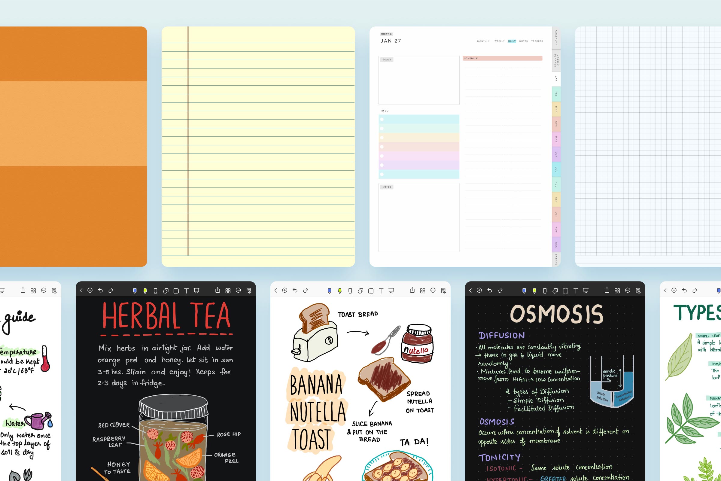
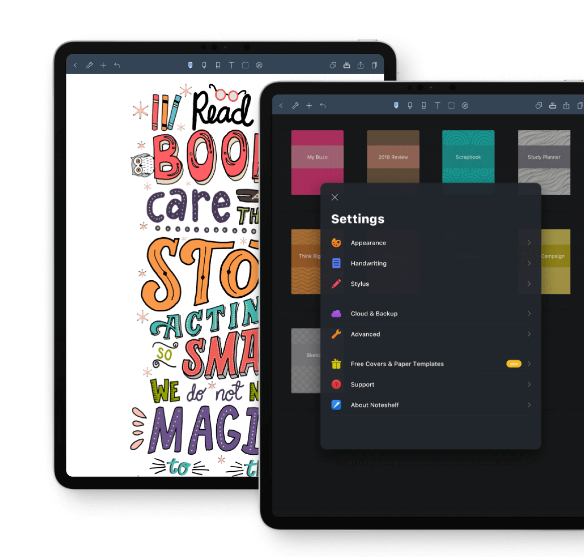
2. Make paper templates scaleable across resolutions.
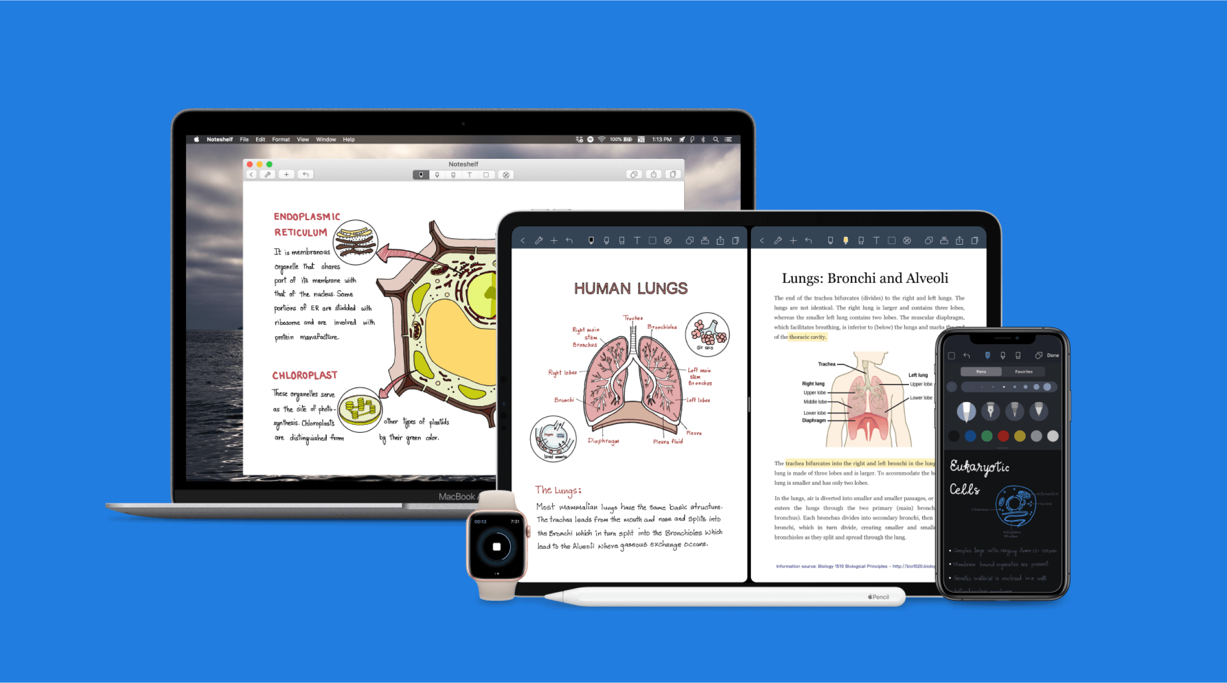
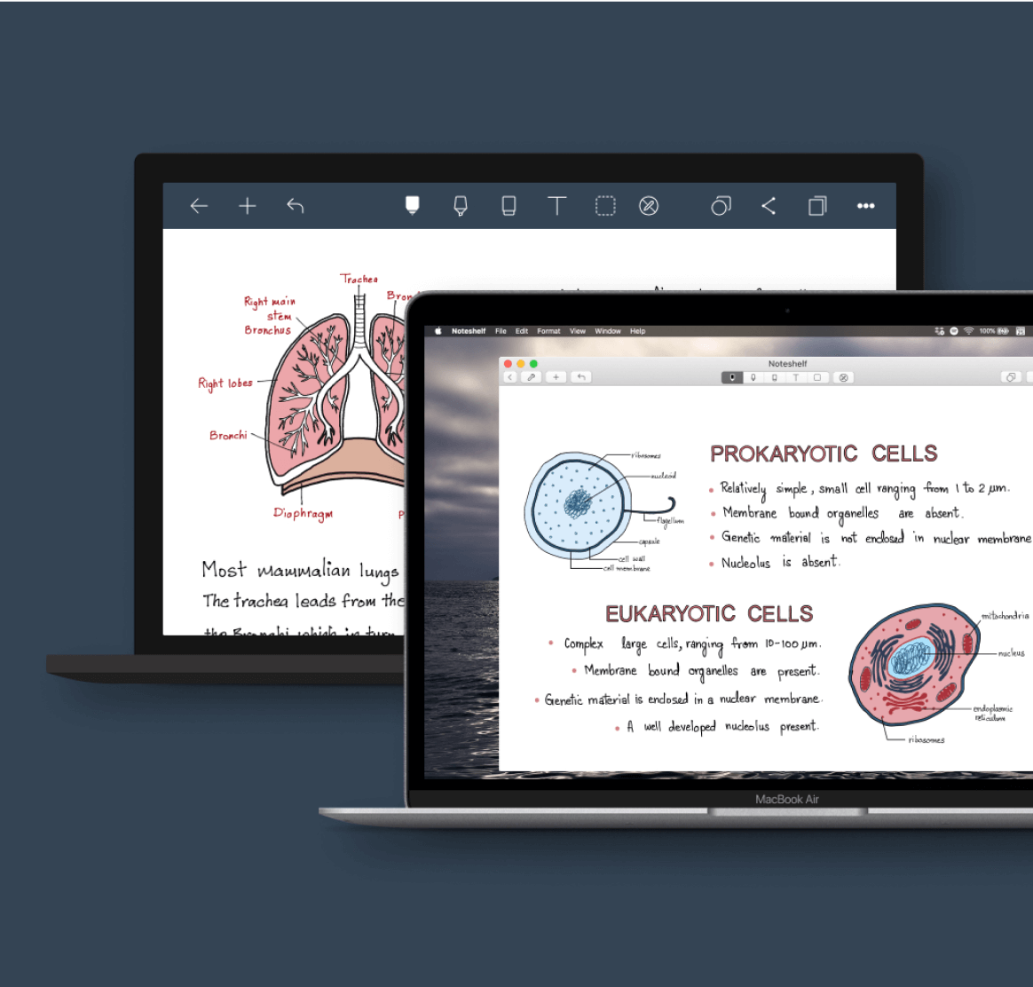
3. Which then allows cross-device syncing, one of the most highly requested features.
4. Retain Noteshelf’s personality that has become well-loved by the evolved userbase.
Through the next months...
I worked closely with the development team, support team and beta testers.
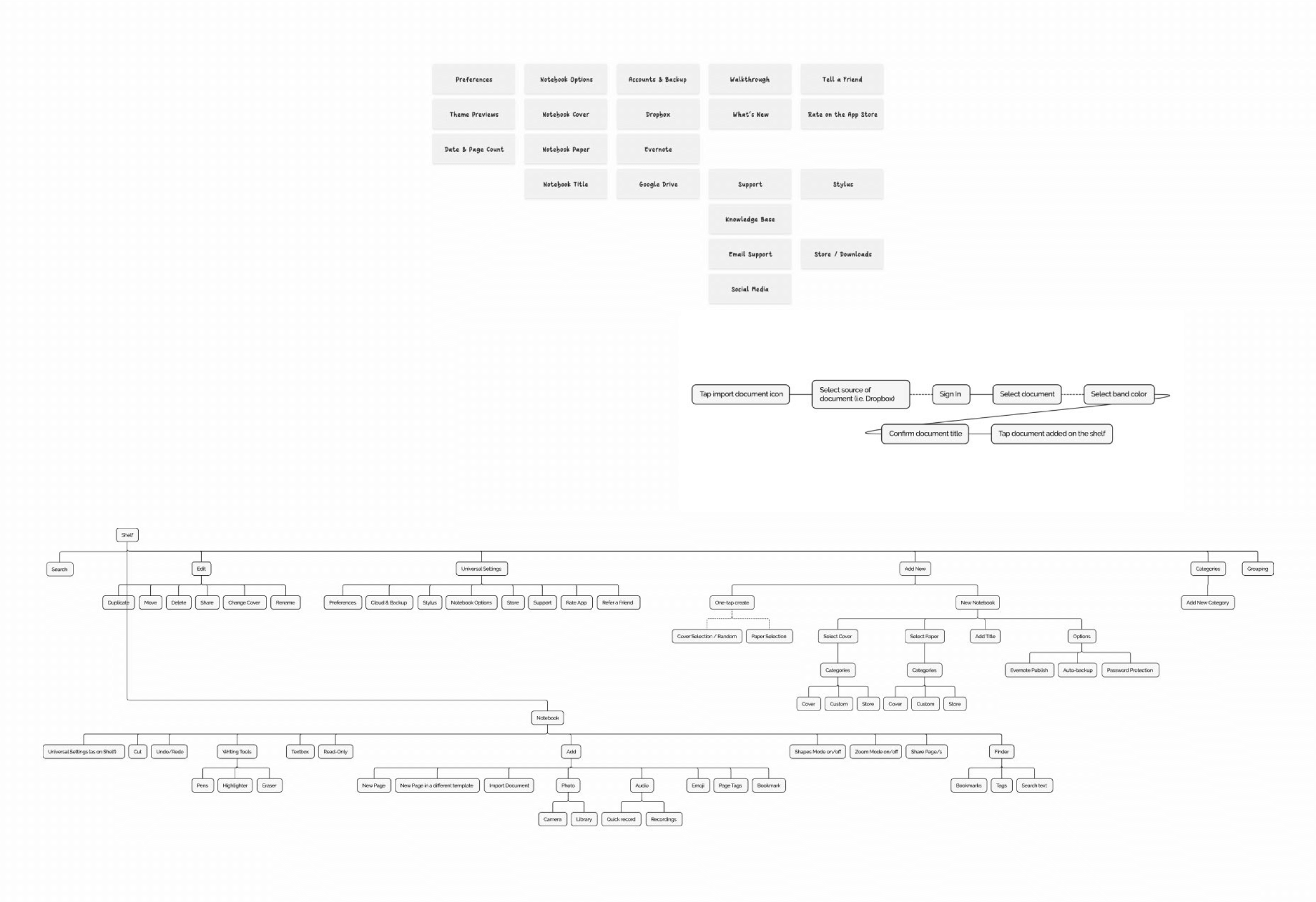
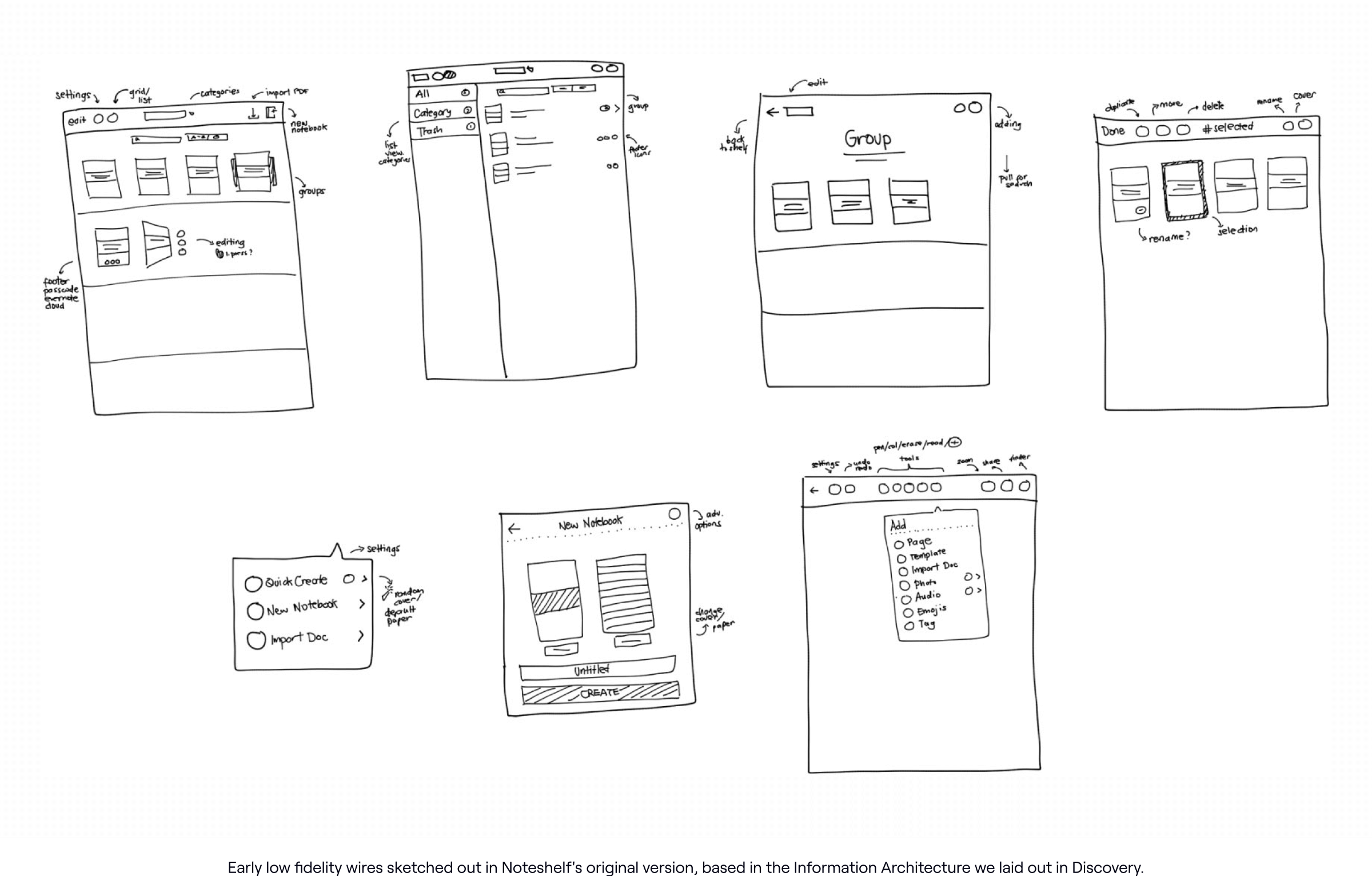
Heavily using the insights we gathered during discovery, we prepared flowcharts, priority maps and mockups that directly complement the goals we set out to have.
With the support of our avid testers, we were testing out early assumptions and concepts, and were able to carefully craft the improved experience we wanted Noteshelfers to have.
It was a circular iterative process (even to this day!) that at times felt frustrating with the technical roadblocks, remote-based challenges, design constraints and startup resource management.
Then finally, Noteshelf 2 was officially released. 🥳

